Puplinge - Visit Website

Overview
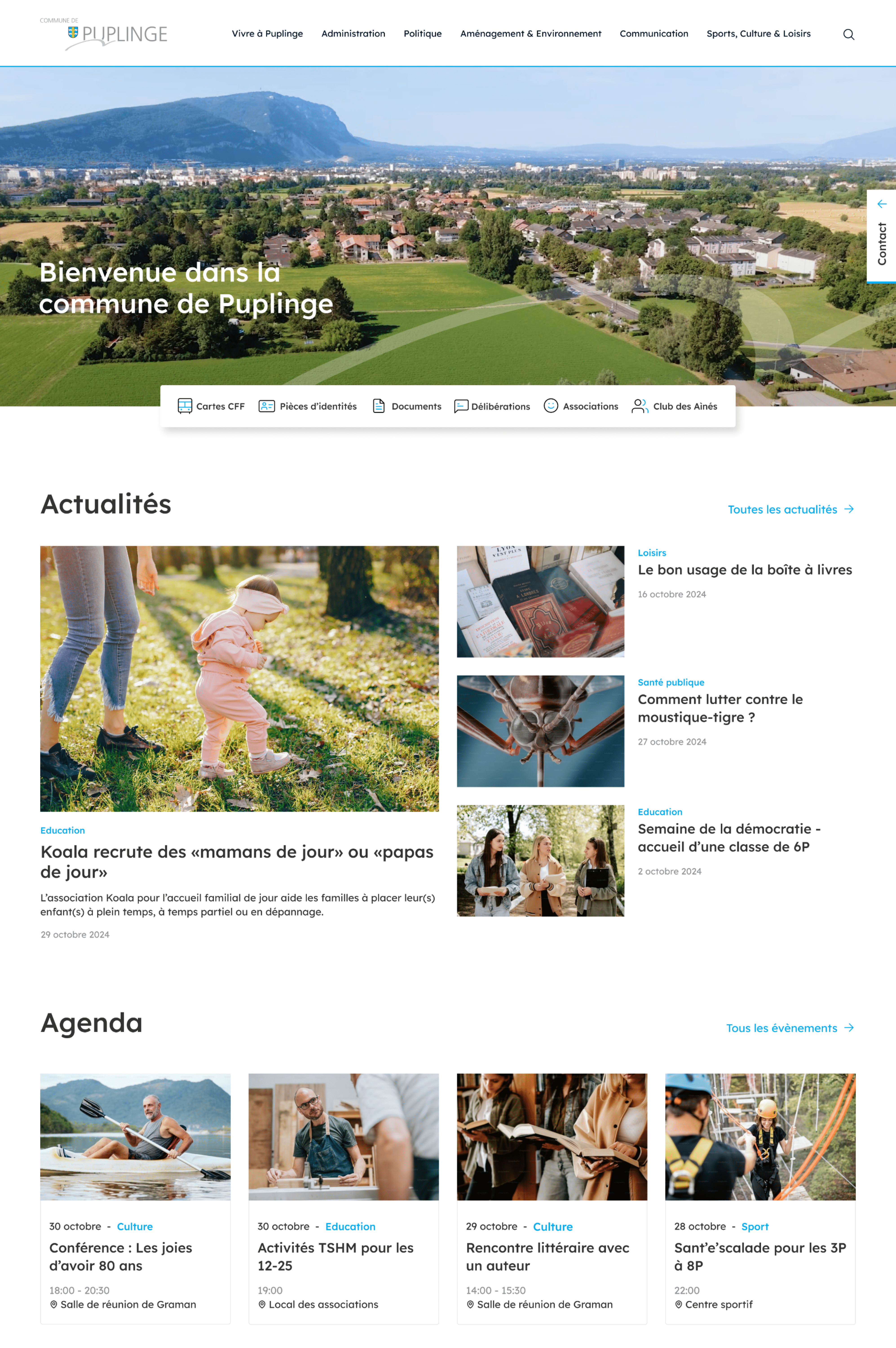
The Municipality of Puplinge is enhancing its digital experience with a new website developed by iomedia.
Beyond a visual and structural redesign, the project also includes an upgrade to the CMS, designed to make day-to-day content management even easier for the municipal administration while offering new possibilities in terms of functionality and page layouts.
The goal: to provide residents with a clearer, more intuitive user experience while equipping the municipal team with a modern, flexible and scalable tool.
| Design | Design system, UI / UX, Figma |
| Front | Vue 2, Nuxt 2, Tailwind |
| Back | AIO V3 Headless |
Challenge
More flexibility for the administration, more possibilities for users
The evolution of the CMS is one of the key elements of the project. Designed to meet the day-to-day needs of the municipal administration, the new content management environment offers greater flexibility in creating, editing and publishing content. The block-based content management system makes it easy to build pages intuitively, adapting their structure and layout to specific needs.
The team now enjoys greater autonomy in managing the website, quickly updating municipal information and enriching content over time. This new technical foundation also makes it possible to integrate additional features and progressively develop the platform in line with the municipality’s evolving needs.


Accessibility
A website designed for today’s needs
The new website’s information architecture has been redesigned to make municipal information more easily accessible.
News, events, administrative procedures, documents, local politics, environment, culture, sports and practical information: content is organised in a clear and consistent way, allowing visitors to quickly find what they are looking for.
The user experience has been designed to ensure smooth navigation across all devices, with particular attention paid to mobile usability and content readability.
Colors
The choice of colours was guided by a number of considerations to ensure optimal harmony and legibility. For this project, we used the colour codes set out in their existing brand guidelines, adapting them for optimal use on digital platforms.